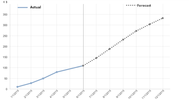
QlikView charts are actors on the stage of data visualization. These charts tell effective story in each application you build. Line chart is my favorite as it tells effective story when you want to depict a trend; normally, you use date as a dimension to plot measure over time.
You can even depict a trend forecast using a QlikView line chart and blend it with actual value in the same line chart. With that you can show actual and forecast values on the same line chart. Cool!
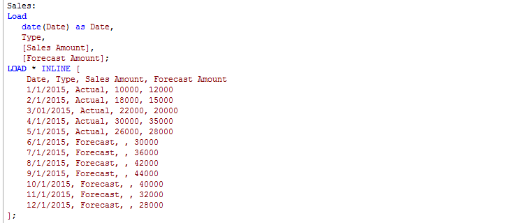
Step 1: Let’s load sample inline table with actual sales and forecast values for the year.
step 2: Now, let’s create a line chart with Date as dimension and following expression
Step 3: Now, let’s use line style from expression list to show dotted line(S3) for the forecast and solid(S1) for actual.
That’s it. You now have created a QlikView line chart that shows actual value and forecast value on the same chart. The line chart will depict actual and forecast value dynamically after daily reload.


