I have been fascinated by Qlikview ever since I first learned about it. As you might imagine, I am spending lots of time to learn this tool.
I am absolutely convinced that Qlikview has a brighter future ahead because more businesses will require smarter business insight faster as businesses compete globally.
I will get into Qlikview’s associative architecture as this blog evolves, but I wanted to share with you my first Qlikview app to show career records of my favorite cricketer, Sachin Tendulkar.
The idea came to my mind after seeing a cool article on one of my favorite blogs featuring this Cricket Legend.
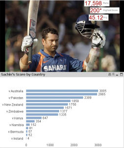
 Qlikview allows you to visualize your data more in tune with how your mind thinks. As you can see, after downloading a spreadsheet containing Sachin’s career scores from 1989 till 2010, I was quickly able to create a bar chart showing his batting score by each country.
I was able to sort score relatively easily to enhance data visualization.
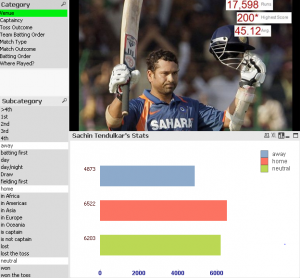
Qlikview has in memory architecture, so in nutshell, it brings all the data for you to explore. With its associate data model, Qlikview not only shows relevant data based on your selection in white color, but also outliers in gray color.
The next info graphics precisely shows the power of Qlikview’s associate data model. This is important since traditional reports created by SQL only show what user asks for. Now, Qlikview not only shows what user wants, but also provides data insight into outliers that user may have desire to perform more research on.
 As you can see, selection shows in green color, related data in white and outliers in gray. In traditional OLAP tool, you can drill down by following a predefined hierarchy; whereas, with Qlikview, user has absolute power to change selection criteria.
I will explore Qlikview’s data model in detail in the future articles. For now, I am happy to write something about the legend I admire and technology I am excited to explore and learn more about.
Photo and data credit: Chandoo.org


