Cyclic groups in QlikView allow you to provide several views of data for a given expression. You can create a cyclic group with multiple fields that user can select from. It’s a great feature to save screen real estate.
What if you want to select different cyclic groups so that a chart renders a view of data based on the group user selects? It’s almost akin to taking the power of cyclic group to a next level. Isn’t it?
Let’s explore a scenario. You are asked to create a chart that provides a way for your users to select either a customer group or a product group so that they can analyze sales by selecting these groups on the fly. Once user selects a group, he/she can cycle through fields within that group to generate additional view of sales.
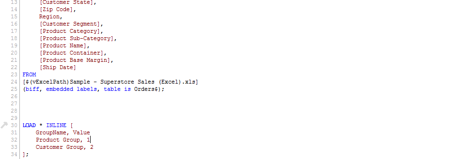
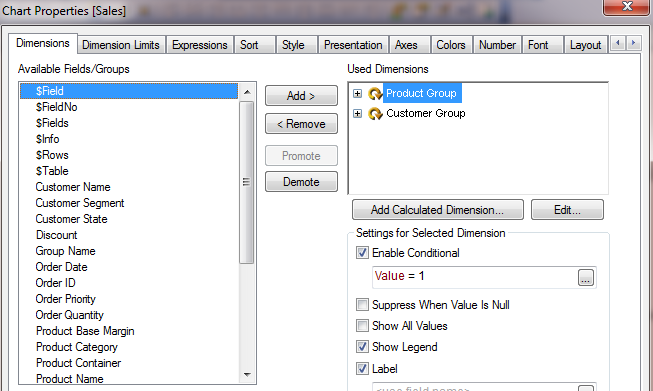
We will begin by loading sales data from an excel file. We will also create a simple in-line table that contains group names. This in-line table will be used to create a list box so that a user can select a group name. It will also be used to enable or disable a cyclic group based on the current selection.
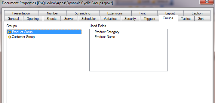
Next, we will create two cyclic groups by selecting Settings –> Document Properties –> Groups
Next, let’s add a list box so that user can select a cyclic group along with a bar chart which contains two cyclic groups as dimensions and sum(sales) as an expression. We will also create a text box that informs user to select a group first so that chart can render aggregation based on a cyclic group user selects.
Now, let’s add a simple conditional show expression in the layout tab of the chart to display chart when user selects a cyclic group and hide it otherwise.
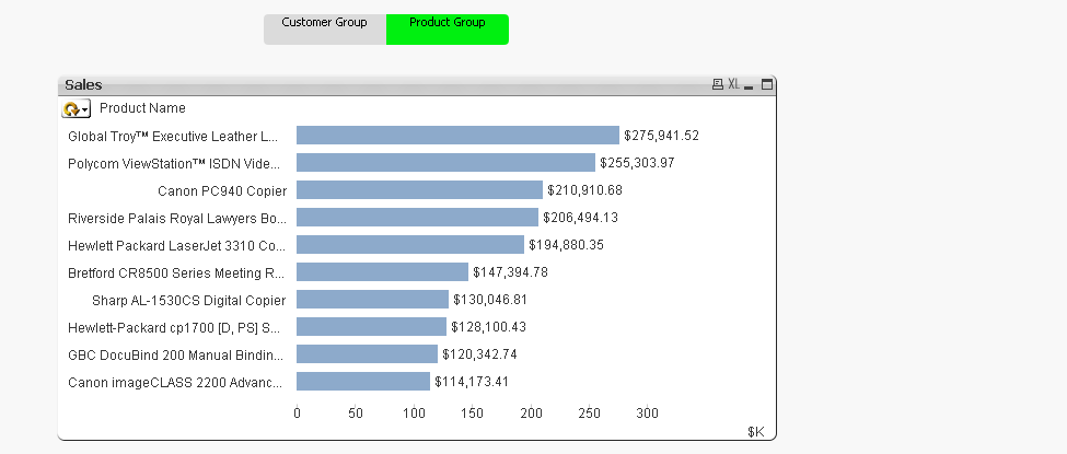
That’s it. Now, your users can select a cyclic group and have a bar chart rendered accordingly. Keep in mind that you apply same approach if your cyclic groups contain expressions rather than dimensions.
Elsewhere:
1. Using Column Visibility via QlikView Cookbook
2. QlikView enablement of Expressions/Dimensions via Qlik Share
3. Everything in its Place via Living QlikView
photo by: anodyn images


