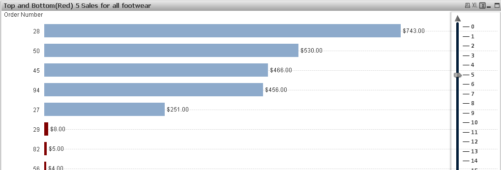
“How can I display top and bottom 10 values in the same chart in Qlikview?,” asked a friend who was dealing with this conundrum. Interesting question, indeed. It is quite easy if you are asked to display top N values as you can use dimension limits to do so. But dimension limits won’t come to your rescue if you are asked to display both top and bottom N values in the same chart.
There are two ways to show top and bottom N values in a chart. First option is to create a calculated dimension and second option is to use Set Analysis syntax in the expression. We will explore both options but since calculated dimensions are resource heavy, we will prefer the option to have an expression with Set Analysis syntax.
Calculated dimension
We will be using Rank and AGGR functions to create a calculated dimension. If you are not familiar with these functions then please review my articles on AGGR function in QlikView and how to use Rank function.
The approach is simple. We will use RANK function to limit top N values along with another RANK function to show bottom N values. We can use minus sign(-) in the sum(Sales) expression to sort values in ascending order.
Using a variable and a slider, now we can not only display top and bottom N values but also change the N value on the fly. Nice! But as you might already know, calculated dimensions are resource heavy as the expression gets evaluated for every row in the data set so performance impact may limit their use for any QlikView apps with large data sets.
An Expression with Set Analysis Syntax
That brings us to the second option — create an expression that involves Set Analysis. Again, if you are not familiar with Set Analysis syntax, I recommend ready my blog post on the basics on Set Analysis.
In this Set Analysis Syntax, we have added same expression involving Rank and AGGR functions in the modifier. It’s interesting to point out that we can use plus sign(+) to add two sub sets: one showing top N values( with sum(Sales)) and another with bottom N values( -sum(Sales)).
That’s all. Now, you have a chart that displays both top and bottom N values. I welcome your ideas if you have a better approach that can accomplish this.
Elsewhere:
1. Note About Dollar-Sign Expansion via QlikView Maven
2. Show Top Performers. Common But Not Too Trivial via Naturalsynergies
3. Set Analysis: Syntaxes, Examples via Qlikcommunity


Thanapat Supphathanthada 11:09 am on October 17, 2016 Permalink
Thank you so much. Your idea was very useful for my project!.