D r. Edward Tufte introduced Slope Graph in his book The Visual Display of Quantitative Information in 1983.
As Dr Tufte pointed out in his book,
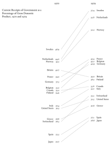
The chart, when read vertically, ranks 15 countries by government tax collections in 1970 and 1979 with name and proportion to the percentages.
Shows how numbers changed between 1970 and 1979 for each country.
Slope provides instant visual cue of percentage increase or decline.
As you can see, chart is using no non-data ink and has minimalist look and feel.
Stefan Walther has created a slope graph extension on the branch. But, you can create a simple slope graph using a line chart.
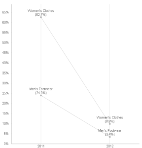
Let’s assume that you want to visualize % category sales between the current year and prior year. Since the data set I have has 2012 as the current year, comparison will be between 2011 and 2012.
First, create a line chart with two dimensions — Year, Category Name
Next, create two expressions — one to show the slope and another to show % value along with category name.
First expression for the slope:
Second expression to show % value along with category name:
Make sure to uncheck all display options except “value on data points”
Make sure not to show legend(presentation tab) and show dimension axis on the axis tab.
That’s all. The slope graph should look very similar to Dr Tufte’s graph that we reviewed earlier.


