Contempt for graphics and their audience, along with the lack of quantitative skills among illustrators, has deadly consequences for graphics work: over-decorated and simplistic designs, tiny data sets, and big lies. — Dr Edward Tufte
Data visualization is part data variation and part design variation. No one else can explain data visualization principles as deftly as Dr. Edward Tufte can.
According to Dr Tufte in his book, The Visual Display of Quantitative Information, a graphic doesn’t distort if the visual representation of data is consistent with the numerical representation.
Simply put, if the size of effect shown in the graphic matches with the size of effect in data then graphic tells the true story. Often, that’s not the case..
Enter Lie Factor; a term coined by none other than Dr Edward Tufte.
Lie Factor = size of effect shown in graphic / sign of effect in data
As a QlikView designer, your job is of course to aim for Lie factor = 0; still sounds bit confusing? Let’s explore few examples.
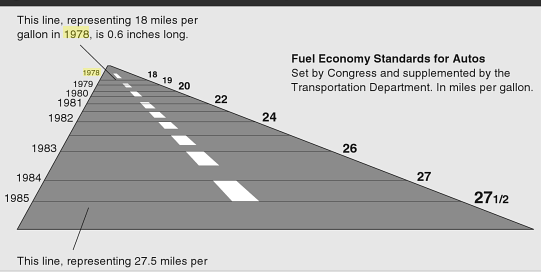
A gallon in 1978, is . 6 inch long whereas a gallon in 1985 is 5.3 inch long. Using this fact, magnitude of change from 1978 to 1985 = (5.3 – .6)/.6 = 783%
Now, the numerical change from 1978 to 1985 = (27.5 – 18) / 18 = 53%
Life factor = 783/53 = 14.8
Not only design variation distorts fact, but it also has some major visualization flaws. For one, future is shown in reverse to exaggerate the severity of mileage standards.
What’s the best possible way to achieve a lie factor of zero? Of course by using a line chart to show change in mileage standards from 1978 to 1985.
You, an awesome QlikView designer, will quickly create a line chart.
Required Fuel Economy Standards: New cars built from 1978 to 1985
Graphical Integrity
As a QlikView designer, let’s try to embrace these principles
1. The representation of numbers, as physically measured on the surface of the graphic itself, should be directly proportional to the numerical quantities represented.
2. Show data variation, not design variation; always choose minimalistic, flat design
3. Increase data ink and avoid chart junk; for example, three dimensions to represent a single dimension or any decoration that adds to design variation.
4. Graphic must not quote data out of context. Imagine if you only show mileage standard from 1984 to 1985 without showing prior years. It may create a misleading depiction.


