Have you seen 3-D pie charts lately? We all have. While the lighting effects make them look pretty, the flash and dazzle hardly improve the core function of data visualization: to convey a clear meaning to the decision makers.
Data visualization is a double-edged sword. It is one of the most powerful ways to transcend data.But, it is also lethal when it can’t convey a clear meaning .
.
Learn to know how to present information visually in an effective way, you must understand a little about visual perception — what works, what doesn’t and why. — Stephen Few, Show Me the Numbers
QlikView is powerful tool when it comes to data visualization, but if the designers who build visualization don’t know how to make sense of it clearly to the decision makers, nothing matters.
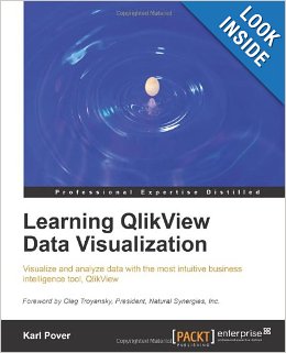
Learning QlikView Data Visualization written by Karl Pover is the first book that covers data visualization best practices and data visualization style guide for various forms of analysis such as Rank, Trend, Multivariate, Distribution, Correlation, Geographical and What-if analysis in QlikView.
The book covers six rules for various forms of analysis. These rules are based on data visualization concepts of two legendary names that we know: Edward Tuft and Stephen Few.
With that in mind, Karl has included chartjunk(a term coined by Edward Tuft) as one of the rules. Chartjunk is any ink that does not show or explain data.
Not only book covers the best usage of various charts for various forms of analysis, it also covers when you should force or not force axis to zero. While not forcing axis to zero for a bar chart may exaggerate differences for the comparison, you can let QlikView choose arbitrary starting point for the line chart as it measures rate of change.
I also enjoyed reading the last chapter on dashboard and navigation. Karl has given thought to all aspects of human visual perception for an effective dashboard design.
If we can understand how perception works, our knowledge can be translated into rules for displaying information. Following perception-based rules, we can present our data in such away that the important and informative patterns stand out. If we disobey the rules, our data will be incomprehensible or misleading. — Colin Ware, Information Visualization: Perception for Design
Learning QlikView Data Visualization offers those rules to help you design effective QlikView data visualization applications.


